반응형
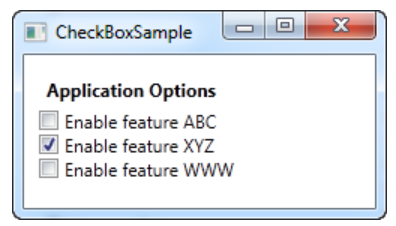
1. CheckBox
[XAML]
<Window x:Class="WpfTutorialSamples.Basic_controls.CheckBoxSample"
        xmlns="http://schemas.microsoft.com/winfx/2006/xaml/presentation"
        xmlns:x="http://schemas.microsoft.com/winfx/2006/xaml"
        Title="CheckBoxSample" Height="140" Width="250">
    <StackPanel Margin="10">
		<Label FontWeight="Bold">Application Options</Label>

		<CheckBox>Enable feature ABC</CheckBox>
        <!--IsChecked="True"로 설정하여 기본을 선택된 상태로 시작하도록 할 수 있음 -->
		<CheckBox IsChecked="True">Enable feature XYZ</CheckBox>
		<CheckBox>Enable feature WWW</CheckBox>
	</StackPanel>
</Window>
[결과]
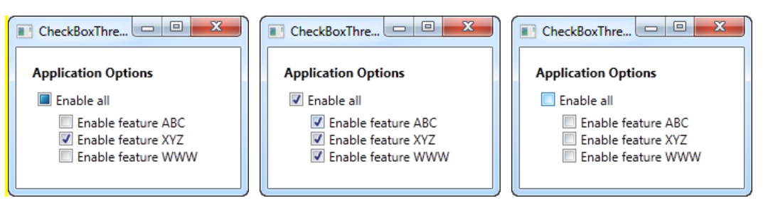
2. CheckBox - IsTreeState
- true, false 외에 null 까지 3가지 상태로 표현하는 방법
[XAML]
<Window x:Class="WpfTutorialSamples.Basic_controls.CheckBoxThreeStateSample"
        xmlns="http://schemas.microsoft.com/winfx/2006/xaml/presentation"
        xmlns:x="http://schemas.microsoft.com/winfx/2006/xaml"
        Title="CheckBoxThreeStateSample" Height="170" Width="300">
	<StackPanel Margin="10">
		<Label FontWeight="Bold">Application Options</Label>
		<StackPanel Margin="10,5">
        	<!--상위 체크박스 : 3가지 상태, 변수명, cbAllFeatures, Checked 상태와 Unchecked 상태일 때 발생하는 이벤트 연결 -->
			<CheckBox IsThreeState="True" Name="cbAllFeatures" Checked="cbAllFeatures_CheckedChanged" Unchecked="cbAllFeatures_CheckedChanged">Enable all</CheckBox>
			<StackPanel Margin="20,5">
				<CheckBox Name="cbFeatureAbc" Checked="cbFeature_CheckedChanged" Unchecked="cbFeature_CheckedChanged">Enable feature ABC</CheckBox>
				<CheckBox Name="cbFeatureXyz" IsChecked="True" Checked="cbFeature_CheckedChanged" Unchecked="cbFeature_CheckedChanged">Enable feature XYZ</CheckBox>
				<CheckBox Name="cbFeatureWww" Checked="cbFeature_CheckedChanged" Unchecked="cbFeature_CheckedChanged">Enable feature WWW</CheckBox>
			</StackPanel>
		</StackPanel>
	</StackPanel>
</Window>
[Code-Behind]
using System;
using System.Windows;

namespace WpfTutorialSamples.Basic_controls
{
	public partial class CheckBoxThreeStateSample : Window
	{
		public CheckBoxThreeStateSample()
		{
			InitializeComponent();
		}

		// 상위 체크박스에서 발생 -> 하위의 모든 체크박스의 상태 변경
		private void cbAllFeatures_CheckedChanged(object sender, RoutedEventArgs e)
		{
			bool newVal = (cbAllFeatures.IsChecked == true);
			cbFeatureAbc.IsChecked = newVal;
			cbFeatureXyz.IsChecked = newVal;
			cbFeatureWww.IsChecked = newVal;
		}

		// 하위 체크박스에서 발생 -> 셋의 상태에 따라 상위 체크박스의 상태 변경
		private void cbFeature_CheckedChanged(object sender, RoutedEventArgs e)
		{
			cbAllFeatures.IsChecked = null;
			if((cbFeatureAbc.IsChecked == true) && (cbFeatureXyz.IsChecked == true) && (cbFeatureWww.IsChecked == true))
				cbAllFeatures.IsChecked = true;
			if((cbFeatureAbc.IsChecked == false) && (cbFeatureXyz.IsChecked == false) && (cbFeatureWww.IsChecked == false))
				cbAllFeatures.IsChecked = false;
		}

	}
}
[결과]
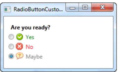
3. RadioButton
- 선택 목록 중 한 개만 선택 가능한 컨트롤
[XAML]
<Window x:Class="WpfTutorialSamples.Basic_controls.RadioButtonCustomContentSample"
        xmlns="http://schemas.microsoft.com/winfx/2006/xaml/presentation"
        xmlns:x="http://schemas.microsoft.com/winfx/2006/xaml"
        Title="RadioButtonCustomContentSample" Height="150" Width="250">
	<StackPanel Margin="10">
		<Label FontWeight="Bold">Are you ready?</Label>
		<RadioButton>
			<WrapPanel>
				<!--이미지 삽입, 너비 16, 높이 16, 여백 상하좌우 0050-->
				<Image Source="/WpfTutorialSamples;component/Images/accept.png" Width="16" Height="16" Margin="0,0,5,0" />
				<!--내용: Yes, 글자 색 : 초록 -->
				<TextBlock Text="Yes" Foreground="Green" />
			</WrapPanel>
		</RadioButton>
		<RadioButton Margin="0,5">
			<WrapPanel>
				<Image Source="/WpfTutorialSamples;component/Images/cancel.png" Width="16" Height="16" Margin="0,0,5,0" />
				<TextBlock Text="No" Foreground="Red" />
			</WrapPanel>
		</RadioButton>
		<RadioButton IsChecked="True">
			<WrapPanel>
				<Image Source="/WpfTutorialSamples;component/Images/question.png" Width="16" Height="16" Margin="0,0,5,0" />
				<TextBlock Text="Maybe" Foreground="Gray" />
			</WrapPanel>
		</RadioButton>
	</StackPanel>
</Window>
[결과]
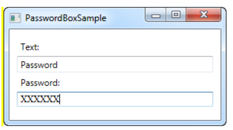
4. PasswordBox
- 실제 문자가 아닌 다른 것을 표시하여 비밀번호를 숨길 수 있음
[XAML]
<Window x:Class="WpfTutorialSamples.Basic_controls.PasswordBoxSample"
        xmlns="http://schemas.microsoft.com/winfx/2006/xaml/presentation"
        xmlns:x="http://schemas.microsoft.com/winfx/2006/xaml"
        Title="PasswordBoxSample" Height="160" Width="300">
    <StackPanel Margin="10">
        <Label>Text:</Label>
        <TextBox />
        <Label>Password:</Label>
        <!--암호의 최대길이 6, 비밀번호를 가릴 문자 X(기본은 점)-->
        <PasswordBox MaxLength="6" PasswordChar="X" />
    </StackPanel>
</Window>
[결과]
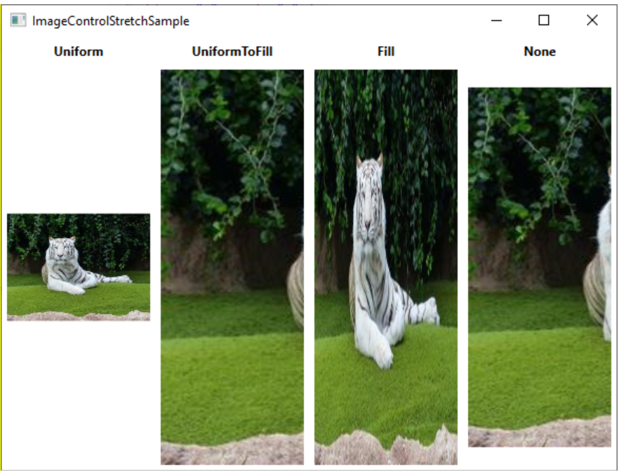
5. Image
- Source : 어떤 이미지를 표시해야 하는지 명시
- Stretch : 이미지의 너비, 높이가 다른 경우 어떻게 할 지 결정(Uniform, UniformToFill, Fill, None)
[XAML]
<Window x:Class="WpfTutorialSamples.Basic_controls.ImageControlStretchSample"
    xmlns="http://schemas.microsoft.com/winfx/2006/xaml/presentation"
    xmlns:x="http://schemas.microsoft.com/winfx/2006/xaml"
    xmlns:d="http://schemas.microsoft.com/expression/blend/2008"
    xmlns:mc="http://schemas.openxmlformats.org/markup-compatibility/2006"
    xmlns:local="clr-namespace:WpfTutorialSamples.Basic_controls"
    mc:Ignorable="d"
    Title="ImageControlStretchSample" Height="450" Width="600">
    <Grid>
    <Grid.ColumnDefinitions>
        <ColumnDefinition Width="*" />
        <ColumnDefinition Width="*" />
        <ColumnDefinition Width="*" />
        <ColumnDefinition Width="*" />
    </Grid.ColumnDefinitions>

    <Grid.RowDefinitions>
        <RowDefinition Height="Auto" />
        <RowDefinition Height="*" />
    </Grid.RowDefinitions>

    <Label Grid.Column="0" HorizontalAlignment="Center" FontWeight="Bold">Uniform</Label>
    <Label Grid.Column="1" HorizontalAlignment="Center" FontWeight="Bold">UniformToFill</Label>
    <Label Grid.Column="2" HorizontalAlignment="Center" FontWeight="Bold">Fill</Label>
    <Label Grid.Column="3" HorizontalAlignment="Center" FontWeight="Bold">None</Label>

    <Image Source="/Images/white_bengal_tiger.jpg" Stretch="Uniform" Grid.Column="0" Grid.Row="1" Margin="5" />
    <Image Source="/Images/white_bengal_tiger.jpg" Stretch="UniformToFill" Grid.Column="1" Grid.Row="1" Margin="5" />
    <Image Source="/Images/white_bengal_tiger.jpg" Stretch="Fill" Grid.Column="2" Grid.Row="1" Margin="5" />
    <Image Source="/Images/white_bengal_tiger.jpg" Stretch="None" Grid.Column="3" Grid.Row="1" Margin="5" />
    </Grid>
</Window>
[결과]