1. ToolTips
- 말 그대로 툴팁을 지원하는 컨트롤
- 단순 문자열이 아닌 객체 유형이기 때문에 어느 곳에나 넣을 수 있음
- ToolTipService.ShowDuration 속성을 이용해 표시되는 시간도 조절할 수 있음
<Window x:Class="WpfTutorialSamples.Control_concepts.ToolTipsSimpleSample"
xmlns="http://schemas.microsoft.com/winfx/2006/xaml/presentation"
xmlns:x="http://schemas.microsoft.com/winfx/2006/xaml"
Title="ToolTipsSimpleSample" Height="150" Width="400">
<Grid VerticalAlignment="Center" HorizontalAlignment="Center">
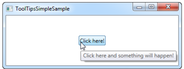
<!--버튼에 툴팁 사용-->
<Button ToolTip="Click here and something will happen!">Click here!</Button>
</Grid>
</Window>(결과)
2. 텍스트 렌더링
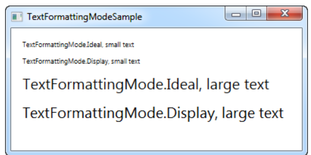
1) TextFormattingMode
- Ideal(기본)과 Display 중에서 선택 가능
- 보통 Ideal 설정이 적합하기에 변경하지 않고 그대로 둠
- 매우 작은 텍스트를 렌더링해야 하는 경우에는 Display 설정이 더 나을 수 있음
<Window x:Class="WpfTutorialSamples.Control_concepts.TextFormattingModeSample"
        xmlns="http://schemas.microsoft.com/winfx/2006/xaml/presentation"
        xmlns:x="http://schemas.microsoft.com/winfx/2006/xaml"
        Title="TextFormattingModeSample" Height="200" Width="400">
    <StackPanel Margin="10">
        <Label TextOptions.TextFormattingMode="Ideal" FontSize="9">TextFormattingMode.Ideal, small text</Label>
        <Label TextOptions.TextFormattingMode="Display" FontSize="9">TextFormattingMode.Display, small text</Label>
        <Label TextOptions.TextFormattingMode="Ideal" FontSize="20">TextFormattingMode.Ideal, large text</Label>
        <Label TextOptions.TextFormattingMode="Display" FontSize="20">TextFormattingMode.Display, large text</Label>
    </StackPanel>
</Window>
(결과)
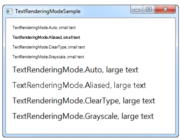
2) TextRenderingMode
- 텍스트를 렌더링할 때 사용되는 anti aliasing(안티 앨리어싱) 알고리즘을 제어할 수 있음
- 앞선 TextFormattingMode 속성의 Display 설정과 함께 사용하면 큰 효과가 있음
<Window x:Class="WpfTutorialSamples.Control_concepts.TextRenderingModeSample"
        xmlns="http://schemas.microsoft.com/winfx/2006/xaml/presentation"
        xmlns:x="http://schemas.microsoft.com/winfx/2006/xaml"
        Title="TextRenderingModeSample" Height="300" Width="400">
    <StackPanel Margin="10" TextOptions.TextFormattingMode="Display">
        <Label TextOptions.TextRenderingMode="Auto" FontSize="9">TextRenderingMode.Auto, small text</Label>
        <Label TextOptions.TextRenderingMode="Aliased" FontSize="9">TextRenderingMode.Aliased, small text</Label>
        <Label TextOptions.TextRenderingMode="ClearType" FontSize="9">TextRenderingMode.ClearType, small text</Label>
        <Label TextOptions.TextRenderingMode="Grayscale" FontSize="9">TextRenderingMode.Grayscale, small text</Label>
        <Label TextOptions.TextRenderingMode="Auto" FontSize="18">TextRenderingMode.Auto, large text</Label>
        <Label TextOptions.TextRenderingMode="Aliased" FontSize="18">TextRenderingMode.Aliased, large text</Label>
        <Label TextOptions.TextRenderingMode="ClearType" FontSize="18">TextRenderingMode.ClearType, large text</Label>
        <Label TextOptions.TextRenderingMode="Grayscale" FontSize="18">TextRenderingMode.Grayscale, large text</Label>
    </StackPanel>
</Window>
(결과)
3. Tab Order
- 우리가 기본적으로 사용하는 탭의 기능을 의미한다.
- 탭을 했을 때 보통 좌우보단 상하를 우선해서 동작하는데 이 동작이 맘에 들지 않을 때 주로 사용한다.
(예시) - 좌우 우선 동작 탭 구현
<Window x:Class="WpfTutorialSamples.Control_concepts.TabOrderSample"
    xmlns="http://schemas.microsoft.com/winfx/2006/xaml/presentation"
    xmlns:x="http://schemas.microsoft.com/winfx/2006/xaml"
    xmlns:d="http://schemas.microsoft.com/expression/blend/2008"
    xmlns:mc="http://schemas.openxmlformats.org/markup-compatibility/2006"
    xmlns:local="clr-namespace:WpfTutorialSamples.Control_concepts"
    mc:Ignorable="d"
    Title="TabOrderSample" Height="250" Width="400">
    <Grid Margin="20">
    <Grid.ColumnDefinitions>
        <ColumnDefinition Width="*" />
        <ColumnDefinition Width="20" />
        <ColumnDefinition Width="*" />
    </Grid.ColumnDefinitions>
    <Grid.RowDefinitions>
        <RowDefinition Height="*" />
        <RowDefinition Height="Auto" />
    </Grid.RowDefinitions>

    <!--각 컨트롤마다 TabIndex의 번호를 지정하여 사용자가 우선순위를 매길 수 있다.-->
    <StackPanel>
        <Label>First name:</Label>
        <TextBox TabIndex="0" />
        <Label>Street name:</Label>
        <TextBox TabIndex="2" />
        <Label>City:</Label>
        <TextBox TabIndex="5" IsReadOnly="True" IsTabStop="False" Background="Gainsboro" />
    </StackPanel>

    <StackPanel Grid.Column="2">
        <Label>Last name:</Label>
        <TextBox TabIndex="1" />
        <Label>Zip Code:</Label>
        <TextBox TabIndex="4" />
    </StackPanel>

    <Button Grid.Row="1" HorizontalAlignment="Right" Width="80">Add</Button>
    <Button Grid.Row="1" Grid.Column="2" HorizontalAlignment="Left" Width="80">Cancel</Button>
    </Grid>
</Window>
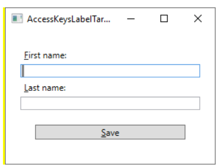
4. Access Keys
- 액세스 키는 Alt 키를 누른 채로 다른 키를 눌러 위도우 내의 특정 컨트롤에 접근하는 방법을 말한다.
- 마우스를 사용하지 않고 키보드로만 윈도우를 조작할 수 있기에 액세스 키를 사용하면 편의성이 높아진다.
- Text나 Content 속성 내의 문자 앞에 언더바(_)를 붙이는 것으로 쉽게 액세스 키를 정의할 수 있다.
- Label 컨트롤을 이용해 TextBox 컨트롤을 액세스 키로 만들 수 있다.
<!--Label의 Target으로 TextBox의 이름을 연결해주면 Label의 액세스 키를 이용해 TextBox에 접근할 수 있다.-->
<StackPanel Margin="20">
    <Label Content="_First name:" Target="{Binding ElementName=txtFirstName}" />
    <TextBox Name="txtFirstName" />
    <Label Content="_Last name:" Target="{Binding ElementName=txtLastName}" />
    <TextBox Name="txtLastName" />
    <Button Content="_Save" Margin="20"></Button>
</StackPanel>
(결과)
5. Panel
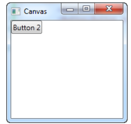
1) Canvas
- canvas를 사용하여 각 자식 컨트롤에 특정 좌표를 할당하여 레이아웃을 완벽하게 제어 가능
- 자식 컨트롤을 수동으로 이동시키고 원하는 방식으로 정렬해야 하기 때문에 유연성이 떨어짐
[예제 1]
<Window x:Class="WpfTutorialSamples.Panels.Canvas"
        xmlns="http://schemas.microsoft.com/winfx/2006/xaml/presentation"
        xmlns:x="http://schemas.microsoft.com/winfx/2006/xaml"
        Title="Canvas" Height="200" Width="200">
	<Canvas>
		<Button>Button 1</Button>
		<Button>Button 2</Button>
	</Canvas>
</Window>
[결과]
- 절대적인 위치를 나타내기 때문에 같은 방식으로 생성할 경우 같은 위치에 같은 크기로 놓이게 되어 나중에 생성된 버튼이 먼저 생성된 버튼을 가리고 아래 그림처럼 보이게 된다.
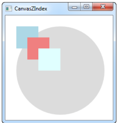
[예제 2]
1) ZIndex를 사용하지 않은 경우
Download & run this example
<Window x:Class="WpfTutorialSamples.Panels.CanvasZIndex"
xmlns="http://schemas.microsoft.com/winfx/2006/xaml/presentation"
xmlns:x="http://schemas.microsoft.com/winfx/2006/xaml"
Title="CanvasZIndex" Height="275" Width="260">
<Canvas>
<Ellipse Fill="Gainsboro" Canvas.Left="25" Canvas.Top="25" Width="200" Height="200" />
<Rectangle Fill="LightBlue" Canvas.Left="25" Canvas.Top="25" Width="50" Height="50" />
<Rectangle Fill="LightCoral" Canvas.Left="50" Canvas.Top="50" Width="50" Height="50" />
<Rectangle Fill="LightCyan" Canvas.Left="75" Canvas.Top="75" Width="50" Height="50" />
</Canvas>
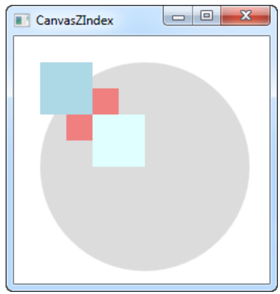
</Window>2) ZIndex를 사용한 경우
<Window x:Class="WpfTutorialSamples.Panels.CanvasZIndex"
        xmlns="http://schemas.microsoft.com/winfx/2006/xaml/presentation"
        xmlns:x="http://schemas.microsoft.com/winfx/2006/xaml"
        Title="CanvasZIndex" Height="275" Width="260">
    <Canvas>
        <Ellipse Panel.ZIndex="2" Fill="Gainsboro" Canvas.Left="25" Canvas.Top="25" Width="200" Height="200" />
        <Rectangle Panel.ZIndex="3" Fill="LightBlue" Canvas.Left="25" Canvas.Top="25" Width="50" Height="50" />
        <Rectangle Panel.ZIndex="2" Fill="LightCoral" Canvas.Left="50" Canvas.Top="50" Width="50" Height="50" />
        <Rectangle Panel.ZIndex="4" Fill="LightCyan" Canvas.Left="75" Canvas.Top="75" Width="50" Height="50" />
    </Canvas>
</Window>
3) 결과
- 왼쪽 사진은 ZIndex를 사용하지 않아 생성한 순서대로 Z축이 결정되고, 오른쪽 사진처럼 ZIndex를 사용한 경우에는 사용자가 지정한 ZIndex의 크기에 따라 물체들의 앞뒤 위치가 결정된다.
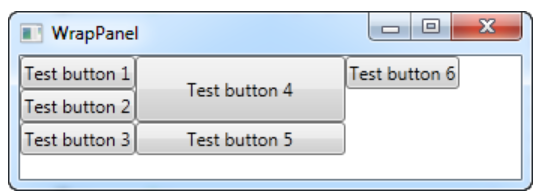
2) WrapPanel
- 더 이상 공간이 없을 때까지 각 자식 컨트롤을 가로 또는 세로로 배치하고 다음 줄로 줄 바꿈을 계속한다.
- 기본형은 가로임
- 가로형일때는 가로로 한 줄 내의 한 물체가 높이가 바뀌면 해당 줄의 모든 물체가 같은 높이로 맞춰지고, 세로형일때는 반대로 세로로 한 줄 내의 물체 중 하나의 너비가 바뀌면 같은 줄의 다른 모든 물체의 너비도 같은 너비로 맞춰진다.
[예제]
<Window x:Class="WpfTutorialSamples.Panels.WrapPanel"
        xmlns="http://schemas.microsoft.com/winfx/2006/xaml/presentation"
        xmlns:x="http://schemas.microsoft.com/winfx/2006/xaml"
        Title="WrapPanel" Height="120" Width="300">
	<WrapPanel Orientation="Vertical">
		<Button>Test button 1</Button>
		<Button>Test button 2</Button>
		<Button>Test button 3</Button>
        <!--세로형이므로 같은 열의 너비는 같아지나, 높이는 4번버튼만 변경됨-->
		<Button Width="140" Height="44">Test button 4</Button>
		<Button>Test button 5</Button>
		<Button>Test button 6</Button>
	</WrapPanel>
</Window>
[결과]
- 세로로 순차적으로 생성되며, 버튼 4의 너비에 맞게 버튼 5의 너비가 변화하였지만 높이는 버튼 4만 변화하였다.
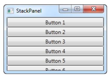
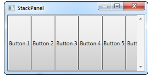
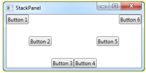
3) StackPanel
- WrapPanel과 매우 비슷
- 하위 컨트롤이 너무 많은 공간을 차지하면 배치 가능한 방향으로 패널 자체를 확장함
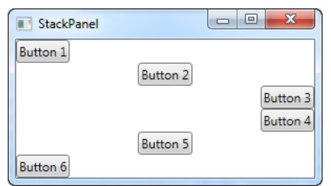
- 기본 방향은 세로이고, 기본 자리 할당 방식은 Stretch로 화면 크기에 딱 맞게 조정된다.
- 기본 모드일 경우에는 HorizontalAlignment를, 가로 모드일 경우에는 VerticalAlignment를 이용해 자리를 특정 방식으로 할당할 수 있다.
[예제 1]
<Window x:Class="WpfTutorialSamples.Panels.StackPanel"
        xmlns="http://schemas.microsoft.com/winfx/2006/xaml/presentation"
        xmlns:x="http://schemas.microsoft.com/winfx/2006/xaml"
        Title="StackPanel" Height="160" Width="300">
	<StackPanel>
    <!--<StackPanel Orientation="Horizontal"> // 가로 모드-->
		<Button>Button 1</Button>
		<Button>Button 2</Button>
		<Button>Button 3</Button>
		<Button>Button 4</Button>
		<Button>Button 5</Button>
		<Button>Button 6</Button>
	</StackPanel>
</Window>
[결과]
- 왼쪽은 기본모드(세로), 오른쪽은 가로모드(Orientation="Horizontal")
[예제 2]
1) 가로모드 할당 방식 변경
<Window x:Class="WpfTutorialSamples.Panels.StackPanel"
        xmlns="http://schemas.microsoft.com/winfx/2006/xaml/presentation"
        xmlns:x="http://schemas.microsoft.com/winfx/2006/xaml"
        Title="StackPanel" Height="160" Width="300">
	<StackPanel Orientation="Horizontal">
		<Button VerticalAlignment="Top">Button 1</Button>
		<Button VerticalAlignment="Center">Button 2</Button>
		<Button VerticalAlignment="Bottom">Button 3</Button>
		<Button VerticalAlignment="Bottom">Button 4</Button>
		<Button VerticalAlignment="Center">Button 5</Button>
		<Button VerticalAlignment="Top">Button 6</Button>
	</StackPanel>
</Window>
2) 기본모드 할당 방식 변경
<Window x:Class="WpfTutorialSamples.Panels.StackPanel"
        xmlns="http://schemas.microsoft.com/winfx/2006/xaml/presentation"
        xmlns:x="http://schemas.microsoft.com/winfx/2006/xaml"
        Title="StackPanel" Height="160" Width="300">
	<StackPanel>
		<Button HorizontalAlignment="Left">Button 1</Button>
		<Button HorizontalAlignment="Center">Button 2</Button>
		<Button HorizontalAlignment="Right">Button 3</Button>
		<Button HorizontalAlignment="Right">Button 4</Button>
		<Button HorizontalAlignment="Center">Button 5</Button>
		<Button HorizontalAlignment="Left">Button 6</Button>
	</StackPanel>
</Window>
[결과]
- 왼쪽이 1번, 오른쪽이 2번
4) DockPanel
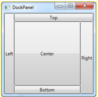
- 하위 컨트롤을 상하좌우 어느 한쪽으로 도킹할 수 있음
- 먼저 작성된 순서대로 배치의 우선순위가 정해짐
- 기본은 중앙에 배치됨
[예제1]
<Window x:Class="WpfTutorialSamples.Panels.DockPanel"
        xmlns="http://schemas.microsoft.com/winfx/2006/xaml/presentation"
        xmlns:x="http://schemas.microsoft.com/winfx/2006/xaml"
        Title="DockPanel" Height="250" Width="250">
	<DockPanel>
		<Button DockPanel.Dock="Left">Left</Button>
		<Button DockPanel.Dock="Top">Top</Button>
		<Button DockPanel.Dock="Right">Right</Button>
		<Button DockPanel.Dock="Bottom">Bottom</Button>
		<Button>Center</Button>
	</DockPanel>
</Window>
[결과]
- left가 먼저 배치되어 왼쪽 모두를 차지하고, 그 다음으로 top이 배치되어 left가 차지한 부분 이외의 나머지 윗 부분을 차지함. 같은 방식으로 right와 bottom이 자리를 차지하게 되고, 마지막으로 가운데에 기본으로 설정한 Center가 오게됨
[예제 2]
<Window x:Class="WpfTutorialSamples.Panels.DockPanel"
xmlns="http://schemas.microsoft.com/winfx/2006/xaml/presentation"
xmlns:x="http://schemas.microsoft.com/winfx/2006/xaml"
Title="DockPanel" Height="300" Width="300">
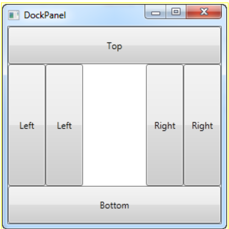
<DockPanel LastChildFill="False">
<Button DockPanel.Dock="Top" Height="50">Top</Button>
<Button DockPanel.Dock="Bottom" Height="50">Bottom</Button>
<Button DockPanel.Dock="Left" Width="50">Left</Button>
<Button DockPanel.Dock="Left" Width="50">Left</Button>
<Button DockPanel.Dock="Right" Width="50">Right</Button>
<Button DockPanel.Dock="Right" Width="50">Right</Button>
</DockPanel>
</Window>[결과]
- LastChildFill을 False로 바꾸어 마지막 자식이 나머지 공간을 차지하지 않게 만들 수 있음
5) Grid
- 가장 복잡한 패널
- 여러 행과 열이 겹쳐질 수 있음
- 각 행의 높이와 각 열의 너비를 픽셀의 절대 크기 또는 사용 가능한 공간의 백분율, 또는 컨텐츠 크기에 따라 행 또는 열을 자동으로 조정한다.
- 여러 열이 필요하고 다른 패널과 함께 사용해야 해서 다른 패널로는 작업이 어려운 경우 사용
- 기본적으로 윈도우 크기에 맞게 각 컨트롤의 최대 크기로 맞춰줌
[예제 1]
<Window x:Class="WpfTutorialSamples.Panels.Grid"
xmlns="http://schemas.microsoft.com/winfx/2006/xaml/presentation"
xmlns:x="http://schemas.microsoft.com/winfx/2006/xaml"
Title="Grid" Height="300" Width="300">
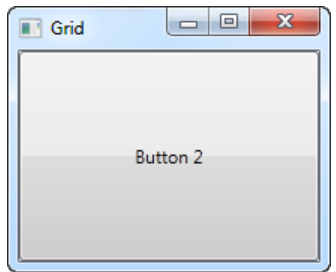
<Grid>
<Button>Button 1</Button>
<Button>Button 2</Button>
</Grid>
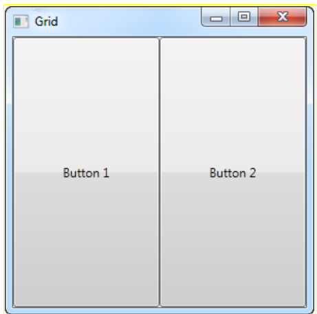
</Window>[결과]
- 최대 크기에 stretch 되어 생성되기 때문에 나중에 생성한 버튼 2가 위에 올라오게 된다.
[예제 2]
<Window x:Class="WpfTutorialSamples.Panels.Grid"
        xmlns="http://schemas.microsoft.com/winfx/2006/xaml/presentation"
        xmlns:x="http://schemas.microsoft.com/winfx/2006/xaml"
        Title="Grid" Height="300" Width="300">
    <Grid>
		<Grid.ColumnDefinitions>
			<ColumnDefinition Width="*" /> <!--첫번째 열의 크기-->
			<ColumnDefinition Width="*" /> <!--두번째 열의 크기-->
		</Grid.ColumnDefinitions>

		<Button>Button 1</Button>
		<Button Grid.Column="1">Button 2</Button> <!--Column은 0부터 시작-->
	</Grid>
</Window>
[결과]
- ColumnDefinitions이므로 열로 분리되고, 정의된 열의 갯수만큼 열이 분리된다.
- *는 각 열의 크기를 동일하게 맞춘다는 의미이다.
- Grid.Column은 각 열에 나타낼 컨트롤을 의미하고 기본값은 0부터 시작한다.
- 버튼 2의 Column이 1이므로 버튼 1은 0열, 버튼 2는 1열에 위치하게 된다.
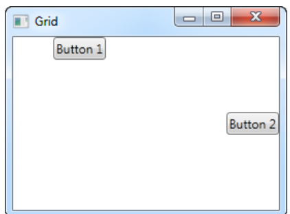
[예제 3]
<Window x:Class="WpfTutorialSamples.Panels.Grid"
        xmlns="http://schemas.microsoft.com/winfx/2006/xaml/presentation"
        xmlns:x="http://schemas.microsoft.com/winfx/2006/xaml"
        Title="Grid" Height="300" Width="300">
    <Grid>
		<Grid.ColumnDefinitions>
			<ColumnDefinition Width="*" />
			<ColumnDefinition Width="*" />
		</Grid.ColumnDefinitions>
		<Button VerticalAlignment="Top" HorizontalAlignment="Center">Button 1</Button>
		<Button Grid.Column="1" VerticalAlignment="Center" HorizontalAlignment="Right">Button 2</Button>
	</Grid>
</Window>
[결과]
- 기본적으로 자식 컨트롤들은 HorizontalAlignment(가로), VerticalAlignment(세로) 모두 기본값인 stretch로 설정되어있어 모든 공간을 차지하고 있지만, 해당 설정을 바꾸어 원하는 위치에 배치 시킬 수 있다.
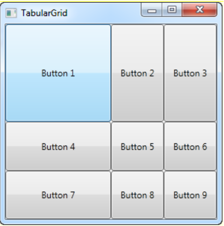
[예제 4]
<Window x:Class="WpfTutorialSamples.Panels.TabularGrid"
        xmlns="http://schemas.microsoft.com/winfx/2006/xaml/presentation"
        xmlns:x="http://schemas.microsoft.com/winfx/2006/xaml"
        Title="TabularGrid" Height="300" Width="300">
    <Grid>
		<Grid.ColumnDefinitions>
			<ColumnDefinition Width="2*" />
			<ColumnDefinition Width="1*" />
			<ColumnDefinition Width="1*" />
		</Grid.ColumnDefinitions>

		<Grid.RowDefinitions>
			<RowDefinition Height="2*" />
			<RowDefinition Height="1*" />
			<RowDefinition Height="1*" />
		</Grid.RowDefinitions>

		<Button>Button 1</Button>
		<Button Grid.Column="1">Button 2</Button>
		<Button Grid.Column="2">Button 3</Button>
		<Button Grid.Row="1">Button 4</Button>
		<Button Grid.Column="1" Grid.Row="1">Button 5</Button>
		<Button Grid.Column="2" Grid.Row="1">Button 6</Button>
		<Button Grid.Row="2">Button 7</Button>
		<Button Grid.Column="1" Grid.Row="2">Button 8</Button>
		<Button Grid.Column="2" Grid.Row="2">Button 9</Button>
	</Grid>
</Window>
[결과]
- *는 숫자와 같이 쓰여 k*라면 1*의 k배라는 의미로 사용되고, 해당 비율만큼 열이나 행이 나눠지게 된다.
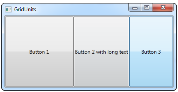
[예제 5]
<Window x:Class="WpfTutorialSamples.Panels.GridUnits"
        xmlns="http://schemas.microsoft.com/winfx/2006/xaml/presentation"
        xmlns:x="http://schemas.microsoft.com/winfx/2006/xaml"
        Title="GridUnits" Height="200" Width="400">
	<Grid>
		<Grid.ColumnDefinitions>
			<ColumnDefinition Width="1*" />
			<ColumnDefinition Width="Auto" /> <!--자동지정-->
			<ColumnDefinition Width="100" /> <!--절대단위-->
		</Grid.ColumnDefinitions>

		<Button>Button 1</Button>
		<Button Grid.Column="1">Button 2 with long text</Button>
		<Button Grid.Column="2">Button 3</Button>
	</Grid>
</Window>
[결과]
- 열 할당 방식에서 Auto(auto)로 쓰이게 되면 글씨의 길이나 크기에 따라 자동으로 열의 크기가 정해진다.
- 열 할당 방식에서 숫자를 지정해서 사용하면 해당 크기로 열의 크기가 정해진다.
[예제 6]
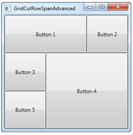
<Window x:Class="WpfTutorialSamples.Panels.GridColRowSpanAdvanced"
        xmlns="http://schemas.microsoft.com/winfx/2006/xaml/presentation"
        xmlns:x="http://schemas.microsoft.com/winfx/2006/xaml"
        Title="GridColRowSpanAdvanced" Height="300" Width="300">
    <Grid>
		<Grid.ColumnDefinitions>
			<ColumnDefinition Width="*" />
			<ColumnDefinition Width="*" />
			<ColumnDefinition Width="*" />
		</Grid.ColumnDefinitions>

		<Grid.RowDefinitions>
			<RowDefinition Height="*" />
			<RowDefinition Height="*" />
			<RowDefinition Height="*" />
		</Grid.RowDefinitions>

		<Button Grid.ColumnSpan="2">Button 1</Button>
		<Button Grid.Column="3">Button 2</Button>
		<Button Grid.Row="1">Button 3</Button>
		<Button Grid.Column="1" Grid.Row="1" Grid.RowSpan="2" Grid.ColumnSpan="2">Button 4</Button>
		<Button Grid.Column="0" Grid.Row="2">Button 5</Button>
	</Grid>
</Window>
[결과]
- span을 이용해 각 셀의 크기를 조절할 수 있음
- span은 차지하는 열 또는 행의 개수라고 생각
[예제 7]
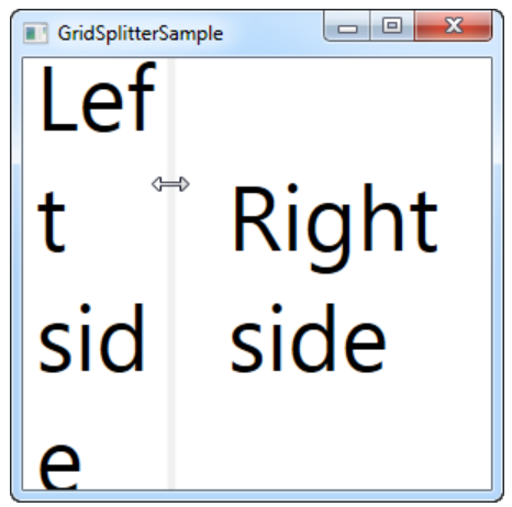
1) 가로 조절
<Window x:Class="WpfTutorialSamples.Panels.GridSplitterSample"
xmlns="http://schemas.microsoft.com/winfx/2006/xaml/presentation"
xmlns:x="http://schemas.microsoft.com/winfx/2006/xaml"
Title="GridSplitterSample" Height="300" Width="300">
<Grid>
<Grid.ColumnDefinitions>
<ColumnDefinition Width="*" />
<ColumnDefinition Width="5" />
<ColumnDefinition Width="*" />
</Grid.ColumnDefinitions>
<TextBlock FontSize="55" HorizontalAlignment="Center" VerticalAlignment="Center" TextWrapping="Wrap">Left side</TextBlock>
<!--GridSplitter-->
<GridSplitter Grid.Column="1" Width="5" HorizontalAlignment="Stretch" />
<TextBlock Grid.Column="2" FontSize="55" HorizontalAlignment="Center" VerticalAlignment="Center" TextWrapping="Wrap">Right side</TextBlock>
</Grid>
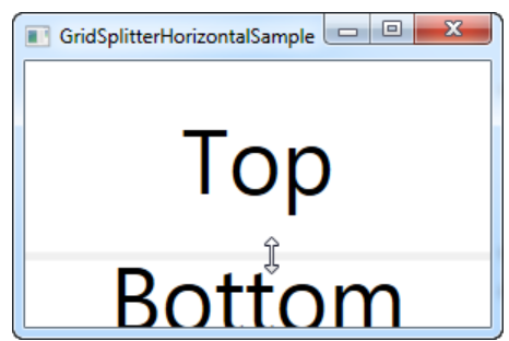
</Window>2) 세로 조절
<Window x:Class="WpfTutorialSamples.Panels.GridSplitterHorizontalSample"
        xmlns="http://schemas.microsoft.com/winfx/2006/xaml/presentation"
        xmlns:x="http://schemas.microsoft.com/winfx/2006/xaml"
        Title="GridSplitterHorizontalSample" Height="300" Width="300">
    <Grid>
        <Grid.RowDefinitions>
            <RowDefinition Height="*" />
            <RowDefinition Height="5" />
            <RowDefinition Height="*" />
        </Grid.RowDefinitions>

        <TextBlock FontSize="55" HorizontalAlignment="Center" VerticalAlignment="Center" TextWrapping="Wrap">Top</TextBlock>

        <!--GridSplitter-->
        <GridSplitter Grid.Row="1" Height="5" HorizontalAlignment="Stretch" />

        <TextBlock Grid.Row="2" FontSize="55" HorizontalAlignment="Center" VerticalAlignment="Center" TextWrapping="Wrap">Bottom</TextBlock>
    </Grid>
</Window>
[결과]
- GridSpiltter 컨트롤을 활용해 가로 또는 세로의 셀의 크기를 사용자가 조절하도록 할 수 있다.
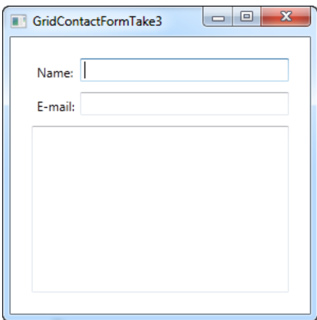
[예제 8]
<Window x:Class="WpfTutorialSamples.Panels.GridContactFormTake2"
        xmlns="http://schemas.microsoft.com/winfx/2006/xaml/presentation"
        xmlns:x="http://schemas.microsoft.com/winfx/2006/xaml"
        Title="GridContactFormTake2" Height="300" Width="300">
	<Grid Margin="10">
		<Grid.ColumnDefinitions>
			<ColumnDefinition Width="Auto" />
			<ColumnDefinition Width="*" />
		</Grid.ColumnDefinitions>

		<Grid.RowDefinitions>
			<RowDefinition Height="Auto" />
			<RowDefinition Height="Auto" />
			<RowDefinition Height="*" />
		</Grid.RowDefinitions>

		<Label>Name: </Label>
		<TextBox Grid.Column="1" Margin="0,0,0,10" />

		<Label Grid.Row="1">E-mail: </Label>
		<TextBox Grid.Row="1" Grid.Column="1" Margin="0,0,0,10" />

        <!--AcceptsReturn : 엔터로 다음 줄로 넘어가게 해줌-->
        <TextBox Grid.ColumnSpan="2" Grid.Row="2" AcceptsReturn="True" />
	</Grid>
</Window>
[결과]
6) UniformGrid
- Grid와 비슷하지만 차이점은 모든 행과 열의 크기가 동일하다는 특징이 있음
6. UserControl
- 사용자가 직접 코드를 짜서 재사용 가능하도록 만들 수 있음
- '솔루션 탐색기>현재 프로젝트 우클릭>추가>사용자 정의 컨트롤' 로 생성가능
[예제]
1) UserControl - XAML
<UserControl x:Class="WpfTutorialSamples.User_Controls.LimitedInputUserControl"
         xmlns="http://schemas.microsoft.com/winfx/2006/xaml/presentation"
         xmlns:x="http://schemas.microsoft.com/winfx/2006/xaml"
         xmlns:mc="http://schemas.openxmlformats.org/markup-compatibility/2006"
         xmlns:d="http://schemas.microsoft.com/expression/blend/2008"
         mc:Ignorable="d"
         d:DesignHeight="300" d:DesignWidth="300">
    <Grid>
    <Grid.RowDefinitions>
        <RowDefinition Height="Auto" />
        <RowDefinition Height="*" />
    </Grid.RowDefinitions>

    <Grid.ColumnDefinitions>
        <ColumnDefinition Width="*" />
        <ColumnDefinition Width="Auto" />
    </Grid.ColumnDefinitions>

    <Label Content="{Binding Title}" />

    <Label Grid.Column="1">
        <StackPanel Orientation="Horizontal">
        <TextBlock Text="{Binding ElementName=txtLimitedInput, Path=Text.Length}" />
        <TextBlock Text="/" />
        <TextBlock Text="{Binding MaxLength}" />
        </StackPanel>
    </Label>

    <TextBox MaxLength="{Binding MaxLength}"
    Grid.Row="1"
    Grid.ColumnSpan="2"
    Name="txtLimitedInput"
    ScrollViewer.VerticalScrollBarVisibility="Auto"
    TextWrapping="Wrap" />
    </Grid>
</UserControl>
2) UserControl - CodeBehind
using System;
using System.Windows.Controls;

namespace WpfTutorialSamples.User_Controls
{
    public partial class LimitedInputUserControl : UserControl
    {
    public LimitedInputUserControl()
    {
        InitializeComponent();
        this.DataContext = this;
    }

    public string Title { get; set; }

    public int MaxLength { get; set; }
    }
}
3) Main - XAML
<Window x:Class="WpfTutorialSamples.User_Controls.LimitedInputSample"
xmlns="http://schemas.microsoft.com/winfx/2006/xaml/presentation"
xmlns:x="http://schemas.microsoft.com/winfx/2006/xaml"
<!--네임스페이스 추가(아직 추가가 안 되었을 수도 있어서 안된다면 빌드 다시 해보기!)-->
xmlns:uc="clr-namespace:WpfTutorialSamples.User_Controls"
Title="LimitedInputSample" Height="200" Width="300">
<Grid Margin="10">
<Grid.RowDefinitions>
<RowDefinition Height="Auto" />
<RowDefinition Height="*" />
</Grid.RowDefinitions>
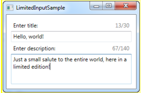
<uc:LimitedInputUserControl Title="Enter title:" MaxLength="30" Height="50" />
<uc:LimitedInputUserControl Title="Enter description:" MaxLength="140" Grid.Row="1" />
</Grid>
</Window>4) 결과
- 직접 생성한 툴을 가져와서 사용할 수 있었다.